
No 'neither' option, #fail.
ATL looks stupid, numeral font is hideous.
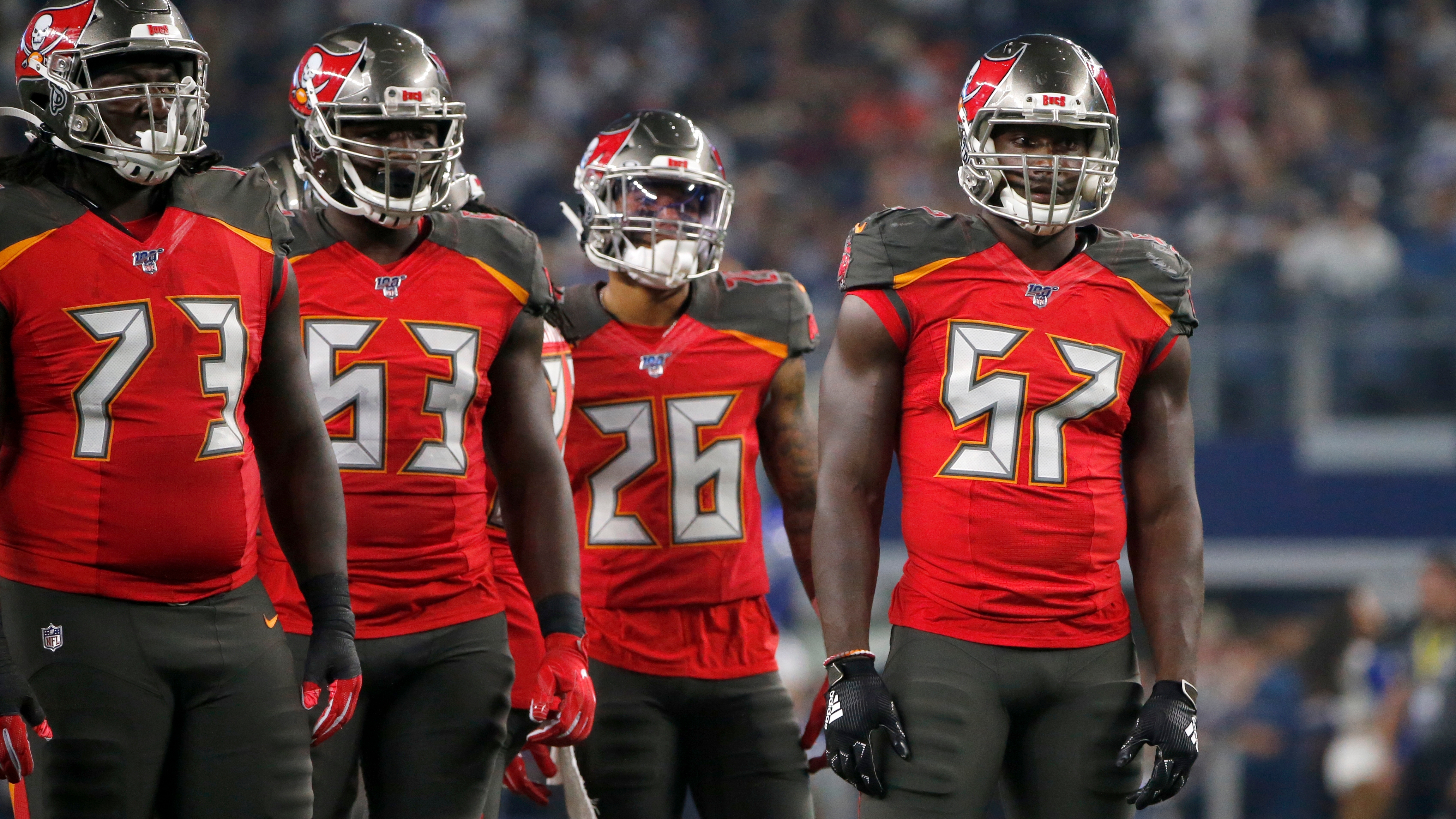
TB should've moved away from those cheesy metallic helmets, and the pewter jersey needs that orange in-between the numerals and the red outline, looks flat compared to the other two jerseys.
ATL looks stupid, numeral font is hideous.
TB should've moved away from those cheesy metallic helmets, and the pewter jersey needs that orange in-between the numerals and the red outline, looks flat compared to the other two jerseys.
I see no changes in the Bucs. Wow.
Falcons all white uniforms look good though. The ATL in the front of the jersey makes it looks like the Atlanta Hawks jerseys.
Falcons all white uniforms look good though. The ATL in the front of the jersey makes it looks like the Atlanta Hawks jerseys.
In both cases the all-white set looks best IMO - with the Bucs edging out the Falcons.. Neither are great but both are improvements over what they had prior.. I'm interested to see what The Rams do. People are hating that new logo..
Buc helmet logo looks ridiculous that big. Red jersey over white pants would be a good home look. That all-bronze is hideous. It just looks brown to me. Surprised they didn't go back to the creamsicles since that's what their fans have been begging for for years..
Even the Falcons players are trying to run away from those jerseysBecause bored.

Even the Falcons players are trying to run away from those jerseys
Why? They don't look like police uniforms
I see no changes in the Bucs. Wow.
I know the alarm-clock set was so bad that the mind wants to erase any memory of it - but yeah these new ones are essentially the same they had before this mess. With bigger logos on the helmet of course.
So the 3 biggest mistakes of the Nike era all reversed now (Bucs Hags and Browns pending). Titans move ever closer the top of that list..
I think the Bucs is a huge improvement just because the previous was that bad. The numbers on the Falcons jersey seem too heavy, IMO.
Add The Browns to the list of "Nike's Modern NFL uniform trend based on hideous athletic shoes aesthetics was a bad idea" along with The Bucs and The Hags..
Chargers win the offseason of new uniforms hands down..
From left 1,2,4 and 5 are fire....
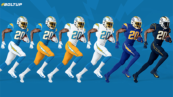
From left 1,2,4 and 5 are fire....
And second place go to New England..
No major departure... Just improvement on all the lame stuff they had going on...
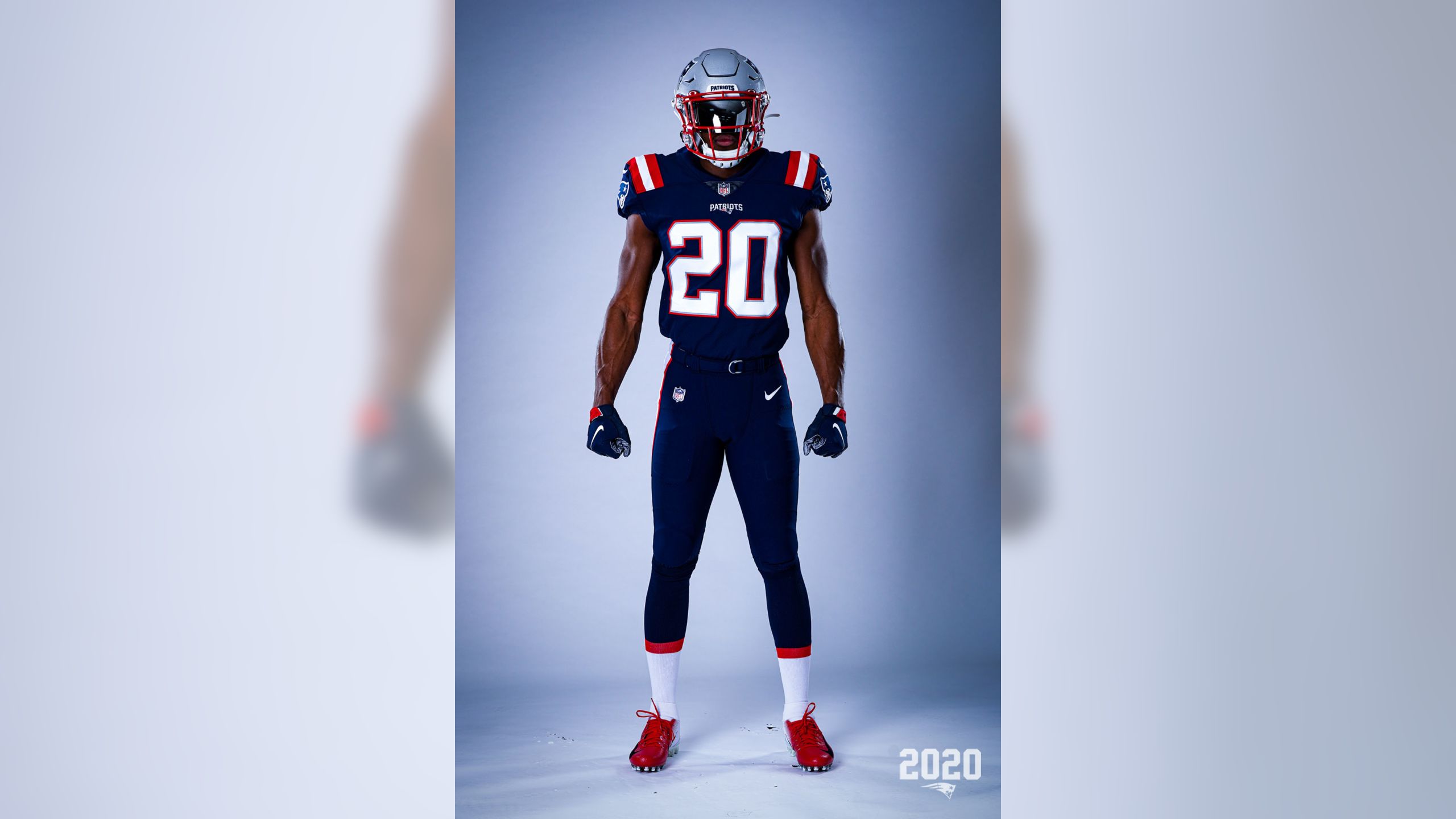
No major departure... Just improvement on all the lame stuff they had going on...
4 is the best out of them. Chargers have always had great looks.Chargers win the offseason of new uniforms hands down..
From left 1,2,4 and 5 are fire....
And finally for 2020 - The LA Rams, who blasphemed tradition and ruined one of the timeless classic helmet designs. FU Nike.
Hey, they fixed the color scheme! Oh wait...
What the....?
Are they really going with a dingy baseball styled road grey? Number fade? Is that a rainbow on the sleeve?
So much much wrong with this.

Hey, they fixed the color scheme! Oh wait...
What the....?
Are they really going with a dingy baseball styled road grey? Number fade? Is that a rainbow on the sleeve?
So much much wrong with this.
Pretty awfulAnd finally for 2020 - The LA Rams, who blasphemed tradition and ruined one of the timeless classic helmet designs. FU Nike.
Hey, they fixed the color scheme! Oh wait...
What the....?
Are they really going with a dingy baseball styled road grey? Number fade? Is that a rainbow on the sleeve?
So much much wrong with this.
- Status
- Not open for further replies.