Stopped by my old Bungs forum and they are just as confused as can be.
What is the verdict round here?


What is the verdict round here?
I always liked the helmet
the rest... who cares
everyones better than brownies anyways
the rest... who cares
everyones better than brownies anyways
Hey Cruds. I hope you’re doing well.
I think I’d need to see the old next to the new to tell a difference.
I always liked the helmets tho.
I think I’d need to see the old next to the new to tell a difference.
I always liked the helmets tho.
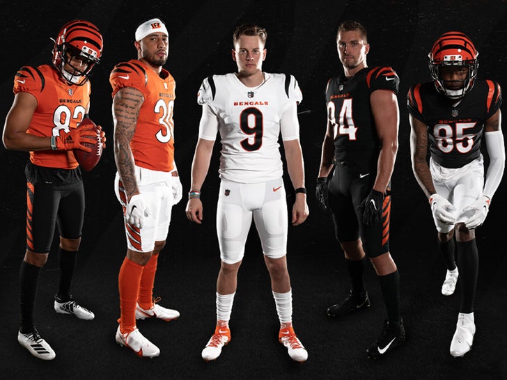
These are just plain and boring. If I had to pick out of the 3 I'd choose the orange tops version.
I always liked the helmet
the rest... who cares
everyones better than brownies anyways
Hey Cruds. I hope you’re doing well.
I think I’d need to see the old next to the new to tell a difference.
I always liked the helmets tho.
The helmet has always been cool
Stopped by my old Bungs forum and they are just as confused as can be.
What is the verdict round here?
These are much better
These are much better
I uno I guess i'm in the minority- I like em better. The all whites are cleaner than the stupid orange strip at top
There's not enough of a difference to really notice to a non-Bengals fan.
I liked the complete re-do we did when the Titans got their new uniforms. I wouldn't mind a complete refresh every 5 years. I still say a silver helmet would look awesome.
I liked the complete re-do we did when the Titans got their new uniforms. I wouldn't mind a complete refresh every 5 years. I still say a silver helmet would look awesome.
gotta dump the fireball... almost nobody likes it
most, like me, tolerate it cause its the team logo
but it blows monkees
use the sword - period
most, like me, tolerate it cause its the team logo
but it blows monkees
use the sword - period
I was really hoping for a silver helmet with the sword logo. Maybe next time?gotta dump the fireball... almost nobody likes it
most, like me, tolerate it cause its the team logo
but it blows monkees
use the sword - period
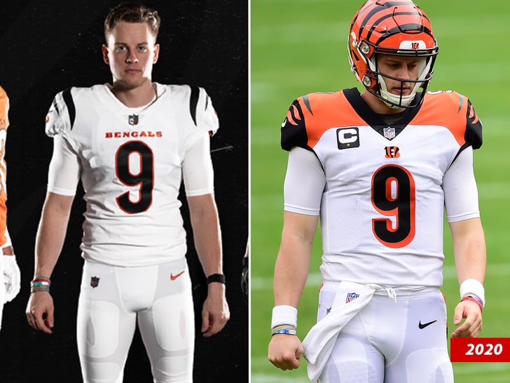
Woof I don't even remember them having the orange shoulders like that. When was that done lol? In my mind, the old ones looked like the new ones. I was surprised by this pic. Much better now. Cleaner. I think that's the new trend. Orange/Black and Black/White look sick.
These are much better
Like the Raiders? I disagree. Keep current color but with a matte finish. Otherwise back to white or Oilier blueI was really hoping for a silver helmet with the sword logo. Maybe next time?
I like the navy helmets, please don't bring back the white, players heads look huge in white lol
Silver is too Patriots
Silver is too Patriots
Those jerseys are really meh. The orange one is okay, but that's just because I like orange. Otherwise, these are boring.
On the helmet talk, a few years back a guy mocked up a new helmet for each team. The Titans one IIRC was a reflective blue or something and used the sword. Looked fricken amazing.
On the helmet talk, a few years back a guy mocked up a new helmet for each team. The Titans one IIRC was a reflective blue or something and used the sword. Looked fricken amazing.
Looking at the home side-by-side, I like the changes. I hate orange as an accent color with the black numbers. Much better now.
The new design keeps the focus on the helmet instead of trying to compete, IMO.
The new design keeps the focus on the helmet instead of trying to compete, IMO.
The color on the shoulders was a bad mistake some teams fell into. It is good to see them correcting it.
- Status
- Not open for further replies.